When I kicked off my independent podcast feed there was budget for just one thing: good podcast artwork.
Your art is critical in communicating style, establishing credibility and building a brand (not to mention a first impression).
It also needs to be practical; clear, bold, and to ‘pop’.
Thousands of people will literally touch this art – we owe it to them to ensure it feels good to press.
Dan Ilic of comedy podcast A Rational Fear asked for feedback on a new tile he’s working on for his series, ‘Greatest moral podcast of our generation’.

This is the most important thing to consider and it’s the most common problem I see all year round.
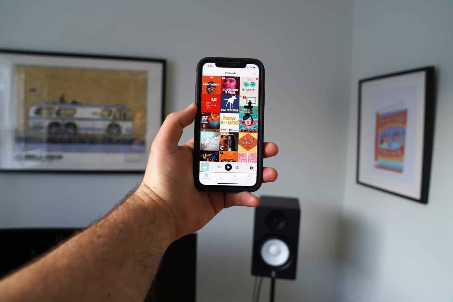
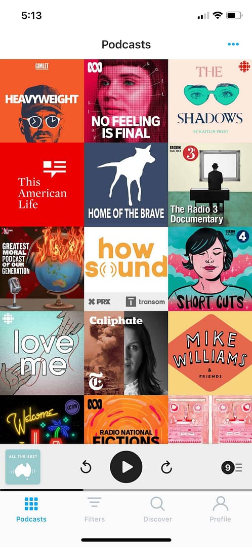
We need to design the tile for the platform (ie podcast players on mobile).
The audience will be interacting with the art when it’s viewed as a very, very small square. So whatever design you have, it’s important to crop it into one or more podcast players and look at it on your phone.
If it doesn’t work here, nothing else matters.
There’s a lot we can take from the platform test.
The first obvious thing is that there’s not a lot of room for detail.
Crowded tiles might show off a designer’s ability, they might look incredible on desktop, but they won’t necessarily be fit for purpose.
Luckily in Dan’s case, there are some obvious elements he could remove to make it bolder and hopefully pop more when shrunk.
I would take out: table, globe stand, microphone, headphones and the little background shimmering x’s.
Less ‘stuff’ could also encourage negative space, which can help with the ‘pop’ and draw attention to what matters.
The striking thing about this art is the world on fire – it speaks to the series title and instantly communicates stakes and why this issue (and podcast) is important.
It’s a strong idea. Removing extra items will make it stronger.
In any podcast related art you do not need headphones or an old timey microphone, ever.
I cannot be more direct than that.
If this were a book, would we draw a pen on the cover?
If this were a film, would we draw a camera on the poster?
The madness must end.
Generally, the title logo (the words) are important and we want them to be as readable as possible.
I would consider making the words big – bigger than you think, so they can be read when viewed on mobile.
For GMPOOG, I think there’s room here to increase the words x4, at least and then keep tweaking from there.
Removing some of the elements in the illustration will buy us the space to do this.
If you are working on a podcast that is part of an existing, recognisable brand, include the logo and make it massive.
The logo is not there to make your marketing person happy or serve to promote the mother brand (although that’s a nice bonus).
Your existing brand logo can serve a purpose in attracting listeners.
When audiences look at a sea of podcast tiles (as we often do on platform) it can feel like they’re at a restaurant looking at a menu and they have no idea what any of the dishes are.
Hard to know what to pick, right?
When presented with this situation, the audience will scan for something they recognise… they want a sign, something; anything to help them make a decision for what to click on in amongst an avalanche of options.
This is where your existing brand logo comes in.
Assuming it’s a trusted, credible brand — make it big.
Dan has worked hard to build an existing audience for ‘A Rational Fear’, it has an solid audience. It’s a missed opportunity to not use that brand awareness.
When it comes to colours, creating contrast will help your tile pop.
Dan has already tweaked the colours from a previous version and look at the difference.
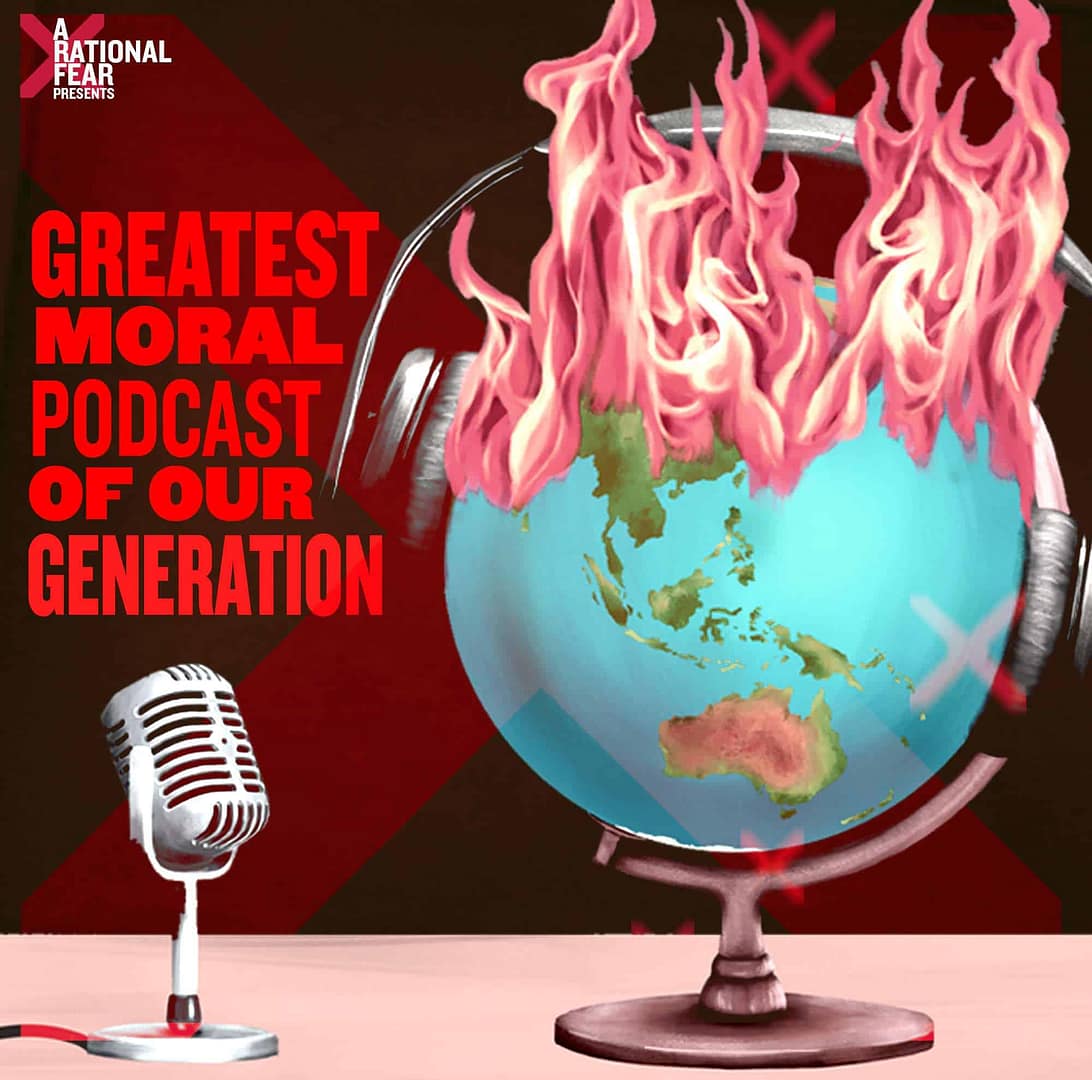
(Side note, notice the creases in the title, like it’s a poster and the glue is falling off with heat – simple and clever).
There’s a reason they print newspapers in black ink on white paper, the contrast doesn’t get better than that.
We want to make decisions about colour consciously.
Stripping back your palate or restricting yourself somehow will help create a mood and make your show more recognisable.
Cadbury is purple
Apple is white
McDonalds is red and yellow
Amazon is that yellowy/orange
Chicken chips are green
If not one, are there two or three core colours that will speak to your brand that you will be able to use across platforms, eg your website?
With GMPOOG the white text is really working. I’d start with a straight black background. Then, I wonder how the ARF maroon (and a hint of yellow) would look as the flames?
It could also be worth experimenting with a white background, black world, ARF maroon flames and then white text of the top of the giant black world?
In a recent conversation, I found myself explaining why I am so interested in making Australian stories and why that has become the through-line in my work.
“But”, my friend said, “You are limiting your audience to only 23 million”.
Only 23 million.
No. Your podcast is not for everyone, and if you think it is then your audience will struggle to find you.
The globe did not end up facing Australia by accident.
I think this is an excellent example of creating context and signaling relevance to the intended audience.
Think about how you could create a context for your audience.
The more specific you can be, the better.
My ultimate test for good podcast artwork is this: would it look good as a bumper sticker or a band logo?
Bumper stickers and band logos require a lot of similar design techniques to cut through.
But more than the practicalities, I think your art should be something you love. Something you would be proud to stick on your car or wear as a t-shirt.
That’s why I always write in the brief that it has to be possible to draw the podcast artwork on a pencil case.
My personal preference is art that tries to be timeless but has room to evolve. I think the key to this ‘classic’ feel is simplicity, stripping as much as possible back and going all in on one idea.
This is why I love to collaborate with artists who have experience in this world. I’ve worked with Steph Hughes and Ashley Ronning specifically because they have a lot of experience making logos and posters for bands and the music industry.
The potential for merchandise should be another consideration when designing your art!
You prioritised the 1×1 design for the platform, cool!
Export this size to upload to pod-catchers, including iTunes: 3000 x 3000 (72 dpi, RGB colours).
I would also export two smaller versions to have on you, say, 1500 x 1500 and 500 x 500.
Now while you’re here, why not adjust your art to be suitable in other formats and platforms.
Thinking about this now will save you coming back later.
Twitter cover art – 1500 x 500
Facebook cover art – 828 x 315
Apple promo tile – 4320 x 1080 (maybe check this one)
Instagram story – 1080 x 1920
General rectangle landscape for web 4×3 – 1024 x 768
General rectangle landscape for web 16×9 – 1920 x 1080 and 1280 x 720
– Look at your tile on podcast apps on your phone (not just on your desktop!)
– Strip back unnecessary details and focus your idea
– Make the words big
– If you choose to use an existing brand logo, make it big
– Contrasting colours and negative space will help it pop
– Limit your colours to create a palate
– Use those colours on other platforms (like your website)
– Create context for your intended audience (eg globe facing Australia)
– Use the bumper sticker test (would you stick it on your car or wear it on your sleeve?)
– Use pencil case test (is it easy enough to draw on a pencil case?)
– Consider merch options now
– Resize for other platforms now

Disregard everything I said.
Break these rules, swap them, throw them out.
I’m not a designer and I have never studied art.
You can and you should do whatever you want.
